

As part of my plan to spend more time bikeshedding building out my web presence than actually creating content, I wanted to build an iOS app that allowed me to share short snippets of text or photos to my blog. I've also always wanted to understand Swift generally and building an iOS app specifically, so it seemed like a nice little rabbit hole.
With the help of Swift UI Apprentice, getting a basic app that posted a content, headline and tags to my API wasn't super difficult (at least, it works in the simulator. I'm not putting it on my phone until it's more useful). I figured adding a share extension would be just as simple, with the real difficulty coming when it came time to posting the image to the server.
Boy was I wrong.
Apple's documentation on Share Extensions (as I think they're called? But honestly it's hard to tell) is laughably bad, almost entirely referring to sharing things out from your app, and even the correct shitty docs haven't been updated in it looks like 4+ years.
There are some useful posts out there, but most/all of them assume you're using UIKit. Since I don't trust Apple not to deprecate a framework they've clearly been dying to phase out for years, I wanted to stick to SwiftUI as much as I could. Plus, I don't reallllly want to learn two paradigms to do the same thing. I have enough different references to keep in my head switching between languages.
Thank god for Oluwadamisi Pikuda, writing on Medium. His post is an excellent place to get a good grasp on the subject, and I highly suggest visiting it if you're stuck. However, since Medium is a semi-paywalled content garden, I'm going to provide a cleanroom implementation here in case you cannot access it.
It's important to note that the extension you're creating is, from a storage and code perspective, a separate app. To the point that technically I think you could just publish a Share Extension, though I doubt Apple would allow it. That means if you want to share storage between your extension and your primary app, you'll need to create an App Group to share containers. If you want to share code, you'll need to create an embedded framework.
But once you have all that set up, you need to actually write the extension. Note that for this example we're only going to be dealing with text shared from another app, with a UI so you can modify it. You'll see where you can make modifications to work with other types.
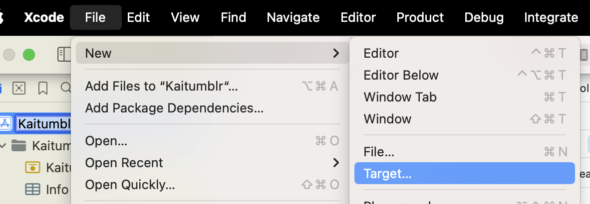
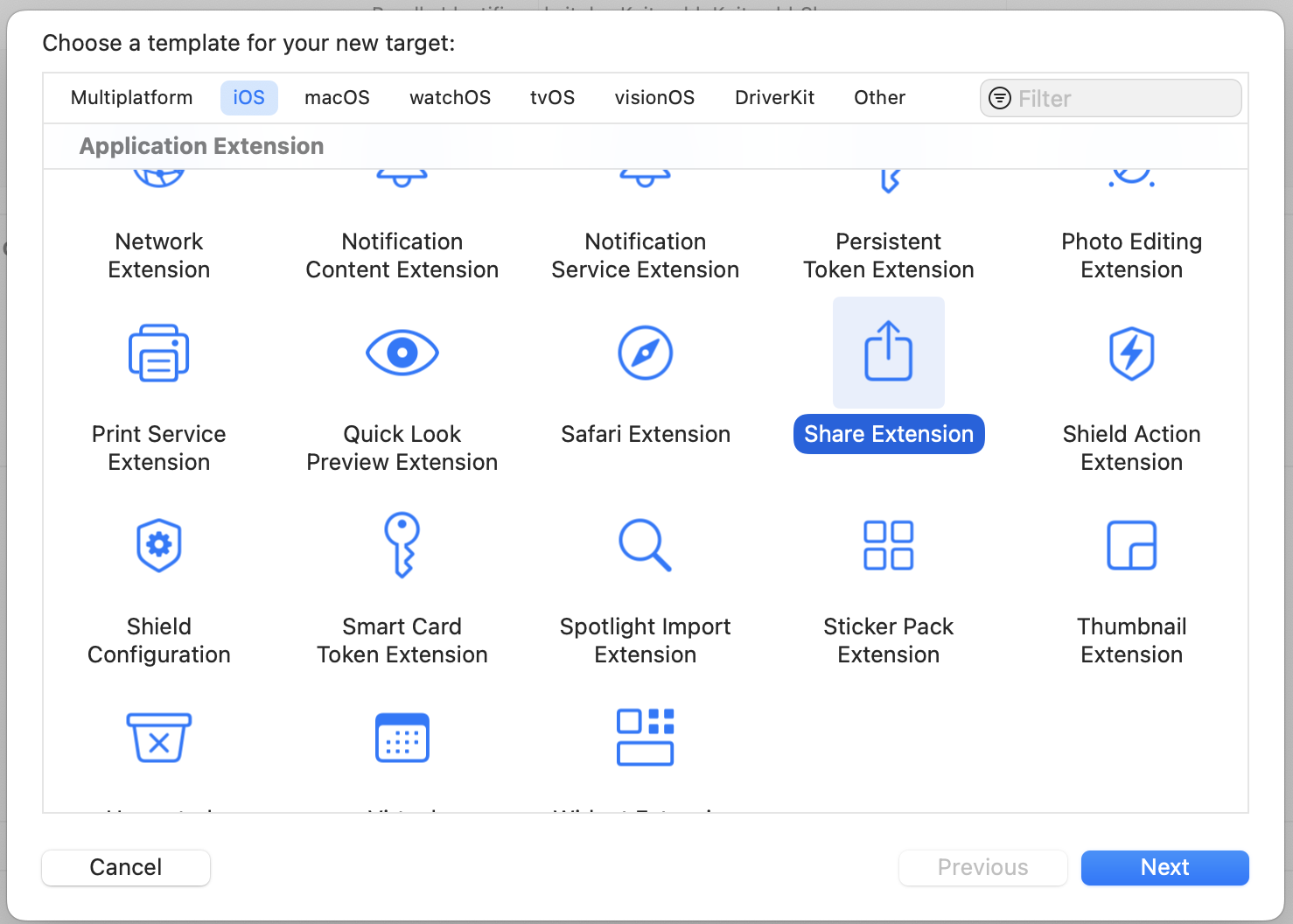
You start by creating a new target (File -> New -> Target, then in the modal "Share Extension").
 Once you fill out the info, this will create a new directory with a UIKit Storyboard file (MainInterface), ViewController and plist. We're not gonna use hardly any of this. Delete the Storyboard file. Then change your ViewController to use the
 UIViewController class. This is where we'll define what the user sees when content is shared. The plist is where we define what can be passed to our share extension.
There are only two functions we're concerned about in the ViewController — viewDidLoad() and close(). Close is going to be what closes the extension while viewDidLoad, which inits our code when the view is loaded into memory.
For close(), we just find the extensionContext and complete the request, which removes the view from memory.
viewDidLoad(), however, has to do more work. We call the super class function first, then we need to make sure we have access to the items that are been shared to us.
`import SwiftUI
class ShareViewController: UIViewController {
override func viewDidLoad() { super.viewDidLoad()
// Ensure access to extensionItem and itemProvider guard let extensionItem = extensionContext?.inputItems.first as? NSExtensionItem, let itemProvider = extensionItem.attachments?.first else { self.close() return } }
func close() {
self.extensionContext?.completeRequest(returningItems: [], completionHandler: nil)
}
}</pre><p>Since again we're only working with text in this case, we need to verify the items are the correct type (in this case, UTType.plaintext`).
`import UniformTypeIdentifiers import SwiftUI
class ShareViewController: UIViewController { override func viewDidLoad() { ...
let textDataType = UTType.plainText.identifier
if itemProvider.hasItemConformingToTypeIdentifier(textDataType) {
// Load the item from itemProvider
itemProvider.loadItem(forTypeIdentifier: textDataType , options: nil) { (providedText, error) in
if error != nil {
self.close()
return
}
if let text = providedText as? String {
// this is where we load our view
} else {
self.close()
return
}
}
}</pre><p>Next, let's define our view! Create a new file, ShareViewExtension.swift. We are just editing text in here, so it's pretty darn simple. We just need to make sure we add a close()function that callsNotificationCenter` so we can close our extension from the controller.
`import SwiftUI
struct ShareExtensionView: View { @State private var text: String
init(text: String) { self.text = text }
var body: some View { NavigationStack{ VStack(spacing: 20){ Text("Text") TextField("Text", text: $text, axis: .vertical) .lineLimit(3...6) .textFieldStyle(.roundedBorder)
Button { // TODO: Something with the text self.close() } label: { Text("Post") .frame(maxWidth: .infinity) } .buttonStyle(.borderedProminent)
Spacer() } .padding() .navigationTitle("Share Extension") .toolbar { Button("Cancel") { self.close() } } } }
// so we can close the whole extension func close() { NotificationCenter.default.post(name: NSNotification.Name("close"), object: nil) } }`
Back in our view controller, we import our SwiftUI view.
`import UniformTypeIdentifiers import SwiftUI
class ShareViewController: UIViewController { override func viewDidLoad() { ... if let text = providedText as? String { DispatchQueue.main.async { // host the SwiftUI view let contentView = UIHostingController(rootView: ShareExtensionView(text: text)) self.addChild(contentView) self.view.addSubview(contentView.view)
// set up constraints contentView.view.translatesAutoresizingMaskIntoConstraints = false contentView.view.topAnchor.constraint(equalTo: self.view.topAnchor).isActive = true contentView.view.bottomAnchor.constraint (equalTo: self.view.bottomAnchor).isActive = true contentView.view.leftAnchor.constraint(equalTo: self.view.leftAnchor).isActive = true contentView.view.rightAnchor.constraint (equalTo: self.view.rightAnchor).isActive = true } } else { self.close() return } } }`
In that same function, we'll also add an observer to listen for that close event, and call our close function.
NotificationCenter.default.addObserver(forName: NSNotification.Name("close"), object: nil, queue: nil) { _ in DispatchQueue.main.async { self.close() } }
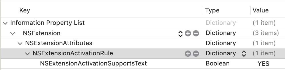
The last thing you need to do is register that your extension can handle Text. In your info.plist, you'll want to add an NSExtensionAttributes dictionary with an NSExtensionActivtionSupportsText boolean set to true.
 You should be able to use this code as a foundation to accept different inputs and do different things. It's a jumping-off point! Hope it helps.
I later expanded the app's remit to include cross-posting to BlueSky and Mastodon, which is a double-bonus because BlueSky STILL doesn't support sharing an image from another application (possibly because they couldn't find the Medium post???)
Note: This site now runs on Statamic
I knew I needed a new website. My go-to content management system was no longer an option, and I investigated some of the most popular alternatives. The first thing to do, as with any project, was ascertain the requirements. My biggest concerns were a) ability to create posts and pages, b) image management, and c) easy to use as a writer and a developer (using my definition of easy to use, since it was my site).
I strongly considered using Drupal, since that's what we (were, until a month ago) going to use at work, but it seemed like a lot of work and overhead to get the system to do what I wanted it to. I (briefly) looked at Joomla, but it too seemed bloated with a fairly unappealing UI/UX on the backend. I was hopeful about some of the Laravel CMSes, but they too seemed to have a bloated foundation for my needs.
I also really dug into the idea of flat-file CMSes, since most (all) of my content is static, but I legitimately couldn't find one that didn't require a NodeJS server. I don't mind Node when it's needed, but I already have a scripting language (PHP) that I was using, and didn't feel like going through the hassle of getting a Node instance going as well.
(Later on I found KirbyCMS, which is probably what I'm going to try for my next client or work project, but I both found it too late in the process and frankly didn't want to lose out on the satisfaction of getting it running when I was ~80% of the way done.)
As I was evaluating the options, in addition to the dealbreakers, I kept finding small annoyances. The backend interface was confusing, or required too many clicks to get from place to place; the speed to first paint was insane; just the time waiting for the content editor to load after I clicked it seemed interminable. At the same time, I was also going through a similarly frustrating experience with cloud music managers, each with a vital missing feature or that implemented a feature in a wonky way.
Then I had an epiphany: Why not just build my own?
I know, I know. It's a tired developer cliche that anything Not Built Here is Wrong. But as I thought it over more, the concept intrigued me. I wasn't setting out to replace WordPress or Drupal or one of the heavy-hitters; I just wanted a base to build from that would allow me to create posts, pages, and maybe some custom ideas later down the road (links with commentary; books from various sources, with reviews/ratings). I would be able to keep it slim, as I didn't have to design for hundreds of use cases. Plus, it would be an excellent learning opportunity, that would allow me to delve deeply into how other systems work and how I might improve upon them (for my specific use case; I make no claim I can do it better than anyone else).
Besides, how long could it take?
Four months later, LinkCMS is powering this website. It's fast and light, it can handle image uploads, it can create pages and posts ... mostly. Hey, it fulfills all the requirements!
Don't get me wrong, it's still VERY MUCH a beta product. I am deep in the dogfooding process right now (especially with some of the text editing, which I'll get into below), but I cannot describe the satisfaction of being able to type in the URL and see the front end, or log in to the backend and make changes, and know that I built it from the ground-up.
LinkCMS is named after its mascot (and, she claims, lead developer), Admiral Link Pengin, who is the best web developer (and admiral) on our Technical Penguins team.
I don't want to go through the whole process in excruciating detail, both because that'd be boring and because I don't remember everything with that many details anyway. I do, however, want to hit the highlights.
-
Flight is a fantastic PHP routing framework. I've used it for small projects in the past, and it was pretty much a no-brainer when I decided I wanted to keep things light and simple. It can get as complicated as you want, but if you browse through the codebase you'll see that it's fairly basic, both for ease of understand and because it was easier to delete and edit routes as separate items.
-
LinkCMS uses the Twig templating system, mostly because I like the syntax.
-
The above two dependencies are a good example of a core principle I tried to keep to: Only use libraries I actually need, and don't use a larger library when a smaller one will do. I could have thrown together a whole CMS in Laravel pretty quickly, or used React or Vue for the front end, but it would have come at the expense of stability and speed, as well as (for the latter two) a laborious build process.
-
I don't hate everything about WordPress! I think block-based editing is a great idea, so this site is built on (custom) blocks. My aim is to have the content be self-contained in a single database row, built around actual HTML if you want to pull it out.
-
One of my favorite features is a Draft Content model. With most CMSes, once a page is published, if you make any changes and save them, those changes are immediately displayed on the published page. At best, you can make the whole post not published and check it without displaying the changes to the public. LinkCMS natively holds two copies of the content for all posts and pages - Draft and Published. If you publish a page, then make edits and save it, those changes are saved to the Draft content without touching the Published part. Logged-in users can preview the Draft content as it will look on the page. Once it's ready, you can Publish the page (these are separate buttons, as seen in the screenshots) for public consumption. Think of it as an integrated staging environment. On the roadmap is a "revert" function so you can go back to the published version if you muck things up too much.
-
One of the things that was super important to me was that everything meet WCAG AA accessibility. Making this a goal significantly limited my options when it came to text editors. There are a few out there that are accessible, but they are a) huge (like, nearly half a megabyte of more, gzipped) and b) much more difficult to extend in the ways I wanted to. Again, with a combination of optimism (I can learn a lot by doing this!) and chutzpah (this is possible!), I decided to write my own editor, Hat (named after Link's penguin, Hat, who wears the same hat as the logo). I'm really pleased with how the Hat editor turned out, though it does still have some issues I discovered while building this site that are in desperate need of fixing (including if you select text and bold it, then immediately try to un-bold it, it just bolds the whole paragraph). But I'm extremely proud to say it that both HatJS and LinkCMS are 100% WCAG AA 2.1 accessible, to the best of my knowledge.
-
Since I was spending so much time on it, I wanted to make sure I could use LinkCMS for future projects while still maintaining the ability to update the core without a lot of complicated git-ing or submodules. I structured the project so that core functionality lives in the primary repo, and everything else (including pages and posts) live in self-contained Modules (let's be real, they're plugins, but it's my playground, so I get to name the imaginary territory). This means you can both update core and modules, AND you only need to have those components included that you're actually using.
-
I used a modified Model-View-Controller architecture: I call the pieces Models, Controllers and Actors. Models and Controllers do what you'd expect. Actors are what actually make changes and make things work. It's easier for me to conceptualize each piece rather than using "View" as the name, which to my mind leaves a lot of things out. I'm aware of the MVAC approach, and I suppose technically the templates are the View, but I lumped the routes and templating in under Actors (Route and Display, accordingly), and it works for me.
I don't think LinkCMS is in a state where someone else could install it right now. (For starters, I'm fairly certain I haven't included the basic SQL yet.) The code is out there and available, and hopefully soon I can get it to a presentable state.
But the end goal of all this was, again, not to be a CMS maven challenging the incumbents. I wanted to learn more about how these systems work (the amount of insight I gained into Laravel through building my own is astounding, to me), and craft a tool that allows me to build small sites and projects, on my own terms, with minimal dependencies and maximum stability.
Mission accomplished.
I set out to build my own CMS in an attempt to circumvent some of the problems I'd had with others in the past. I wound up inventing a whole new set of problems! What a neat idea.
Email newsletters are the future. And the present. And also, at various points, the past. They've exploded in popularity (much like podcasts), hoping that individual creators can find enough people to subscribe to keep them afloat (much like podcasts). It's an idea that can certainly work, though I doubt whether all of the newsletters out there today are going to survive, say, next year, much less in the next 5. (Much like ... well, you get it.) My inbox got to the point where I could find literally dozens of new issues on Sunday, and several more during each day of the week. They were unmanageable on their own, and they were crowding out my legitimate email.
In a perfect world, I could just subscribe to them in Feedly. I am an unabashed RSS reader, with somewhere in the vicinity of 140 active feeds. I am such a hardcore RSS addict that I subscribed to Feedly Pro lifetime somewhere in the vicinity of ... 2013, I think. Gods. It was a great deal ($99), but it means that I miss out on some of the new features, including the ability to subscribe to newsletters. There are also some services out there that seem like they do a relatively good job, but even at $5/month, that's $5 I'm not sending to a writer.
And frankly, I was pretty sure I could build it myself.
Thus was born Newslurp. It's not pretty. I will 100% admit that. The admin interface can be charitably described as "synthwave brutalist." That's because you really shouldn't spend any time there. The whole point is to set it up once and never have to touch the thing again. The interface really only exists so that you can check to see if a specific newsletter was processed.
It's not perfect. There are some newsletters that depend on a weirdly large amount of formatting, and more that have weird assumptions about background color. I've tried to fix those as I saw them, but there are a lot more mistakes out there than I could ever fix. Hopefully they include a "view in browser" link.
Setup is pretty easy.
-
Install dependencies using Composer
-
Use the SQL file in install.sql to create your database
-
Set up your Google API OAuth 2 Authenticaton. Download the client secret JSON file, rename it "client_secret.json" and put it in the project root
-
Navigate to your URL and authenticate using your credentials
-
Set up a filter in your Gmail account to label the emails you want to catch as "Newsletters." You can archive them, but do not delete them (the program will trash them after processing)
-
Visit /update once to get it started, then set up a cron to hit that URL/page however frequently you'd like
That's ... that's pretty much it, actually. It worked like a charm till I started using Hey (which has its own system for dealing with newsletters, which I also like). But it still runs for those of you out there in Google-land. Go forth and free your newsletters!
Loogit me, building the Substack app 3 years too early. And without the infrastructure. OK, I built an RSS feed. But I still saw the newsletter boom coming!
As I've mentioned before, we're moving away from Caspio as our database provider to the extent that it makes sense (not out of utility, it's a function of cost). While we've managed to get some things migrated over, one of the biggest stumbling blocks are the things we use Caspio for the most — simple databases that need to be viewable and searchable online.
We have a number of semi-complex databases (read: more than a single-sheet XLS file) that we're not moving anytime soon (deed transfers database, among others, simply because of how we ingest the data), but there are a number that are little more than spreadsheets that we need to be able to view and search.
We investigated a number of vendor alternatives, but most featured pricing problems similar to Caspio, or had records limits absurdly lower than what we need. (Example: One such service offered 100,000 rows of data for $149/month. For comparison, one of our more popular databases, listing Pennsylvania teachers' salaries, has well over 2 million rows alone.) So, once again, Project Time™.
There is one thing that any aspiring programmer must realize when they set out to replace a tool: YOU CAN'T REPLACE A TOOL AT THE HEART OF A MULTI-MILLION DOLLAR CORPORATION ON YOUR OWN. I knew this academically but, as is often the case when setting out on these adventures, my brain chose to heed that advice only when it was convenient to do so.
I often live by the mantra, "If someone else can do it, that means it's possible." It works well something like 75 percent of the time — it prevents me from feeling daunted when facing large projects, but it can be turned around as well.
My favorite caveat is, "Technically, I could build you a reasonable facsimile of Facebook — it just wouldn't be as good, fast or as useful as the real thing."
It's true in that somebody built Facebook, but (more accurately) thousands of somebodies built Facebook. It's doable, it's just not feasible for one person to replicate it completely on their own.
That being said, Past Me was convinced it couldn't be THAT difficult to take a spreadsheet and present it online, despite the fact that people routinely pay up to and including hundreds/thousands of dollars per month to companies to be able do exactly that.
Ah, hubris.
The first priority involved figuring out how to store the data. The reason the York Daily Record likes Caspio so much is not just its versatility and usefulness, it's how easy it is to use. Caspio spent a lot of time and money into figuring out an interface that, while not everyone can use it and even fewer can take full advantage of all its features, it's easy enough that most people can do basic things with little training. This actually posed the greatest challenge — the data needed to be able to be input and edited in such a way that your average reporter (think 35-year-old metro reporter, not 23-year-old working at The Verge) would be able to do so without having to email/call me every five minutes. That ruled traditional databases out right away. (Which is not to say that you can't build an edit-friendly MySQL frontend, but I didn't have that kind of build time for this project.)
The easiest and cheapest way forward seemed to be (as ever) through Google. Though I'm becoming more wary of Google Docs' live-editing capabilities, for the purpose of "storing data and being able to edit it directly," Sheets fit the bill.
Because our CMS does not allow for server-side code inclusion (another story for another time), inserting the data into articles needs to be accomplished via JavaScript drop-in. Since we're going to be building it in JS anyway (and I'm a firm believer on not doing the same work twice unless I forget to commit something to the repository), I figured we'd just use one codebase for both the widget version and the standalone.
After a little bit of searching (I got burned out going through a dozen different Caspio alternatives), I settled on DataTables as our jQuery plugin of choice.
Here's the part where I always have trouble when trying to relate the struggles of the average newspaper's newsroom to the more digital-focused newsrooms who have multiple app developers and coders on staff — most newspaper reporters do not have the coding ability beyond making a link or typing into the TinyMCE in WordPress.
You can get them to do things like a YouTube embed using a tag interface [Youtube: https://www.youtube.com/watch?v=jvqfEeuRhLY], but only after some heavy-duty brainwashing (and we still struggle with getting Excerpts right).
So while I and probably three or four in our newsroom have no problem using Quartz's excellent ChartBuilder, it's not something we can just send out to the general population with a "use this!" subject line and expect results.
While some might be content with a simple "Use DataTables!" and inserting some code to auto-activate the tables when people set them up properly, asking your average journalist to use JavaScript parameters is a fool's errand, and we're not even within driving distance of, "Oh yeah, and get your Sheet into JSON for DataTables to use."
Which is not to call them stupid — far from it. It's just that these are people who spent a bunch of time (and, likely, money) to learn how to write stories properly. Then they got to work anytime after 2005 and discovered that it wasn't enough — they have to learn Twitter, Facebook, an ever-increasing number of content managements systems and (oh yeah!) they still have to do it while writing their stories. All of this is doable, of course, but to ask them to learn HTML and JavaScript and every new thing someone invents (which even I have given up all hope of keeping up with; there are just too many new things out there) is simply untenable.
Thus, I consider it my number one job to make their jobs easier for them, not just give them something complicated they have to learn just because it does a new thing (or an old thing in a cooler/cheaper way).
For the first version, it's about as simple as can be. People work on their data using their own preferred Google accounts (work or personal), leaving them with a document they can play around with. Once they're to a point where they're ready to present the data to the public, we copy the data into a separate account. This has the advantage of a) keeping the data under our control, in case the reporter quits/leaves/dies/deletes their account, and b) allows the reporter to keep their own copy of the data with the fields they don't want shown to the public (internal notes, personally identifying information, that sort of thing). The reporter then grabs the sheet ID from the URL and puts it in the tool.
Assuming the data passes some very basic tests (every column has a header, only one header row, etc.), they're presented with a list of fields. Because our CMS frontend does not allow for responsive design, all our information lives in 600 pixel-wide boxes. So with a little help from jQuery Modal, I added some functionality to DataTables using the standard hidden fields that hides some columns in the standard presentation, but shows the entire entry's information in a modal if a row is clicked.
For version 1, search is pretty simple: If there's a field, it's searchable. We're hoping to expand on that in later iterations to not search certain fields, as well as create some method of specifically searching fields (as seen in this Caspio implementation). Users then add a title (shown only in the full version; we're assuming wherever the widget drop-in goes, there's already a headline on the article) and customized search text.
They're then taken back to the main screen, where they can find links to the full data page (like this, which we use for our mobile implementation (neither our apps nor our mobile site executes JavaScript, so we always have to include links to a place off our main domain for our mobile readers to view) as well as the drop-in widget code.
Eventually, we hope to add some things like the extended search functionality, a "download data" option and other enhancements. But for now, we feel like we have a tool for basic database work.
10 years later, the projects for the GameTimePA URLs are still live and running, but the main newspaper's domain isn't. But they're pointing to the same server!
It was what you’d call a “hard-and-fast” deadline: Our contract with Caspio for database and data services was changing on July 1. On that day, our account — which to that point had been averaging something like 17GB transferred per month — would have to use no more than 5GB of data per month, or else we’d pay to the tune of $50/GB.
Our biggest data ab/user by far was our user-submitted photo galleries. A popular feature among our readers, it allowed them to both upload photos for us (at print quality) to use in the paper as well as see them online instanteously. Caspio stored and displayed them as a database: Here’s a page of a bunch of photos, click one to get the larger version.
We had to come up with something to replace it — and, as ever, without incurring m/any charges, because we don’t have any money to spend.
Requirements
-
Allow readers to upload photos (bonus: from any device, previously limited to desktop)
-
Store photos and accompanying metadata (name, address, contact info, caption, etc.)
-
Display photos and selected metadata (name, caption) on multiple platforms
-
Allow for editing/deletion after upload
-
Low/no startup or ongoing costs
-
Support multiple news properties without much cost for scaling
-
DO NOT create additional work
Research
There are a number of image hosts out there, of course, but the terms of use on their accounts vary wildly. The two main hosts we looked into were Flickr and Photobucket. Photobucket had the advantage of being Not Yahoo, which was a plus in my eyes, but their variable pricing structure (not conducive to multiple accounts, difficult to budget for the future) and lack of apparent developer support (the page you’re directed toward to set up an account no longer exists) made that seem unwise.
Flickr offers 1 TB of storage for reasonable pricing, but a hard request limit (3600/hour) and reasonable usage request (“You shall not use Flickr APIs for any application that replicates or attempts to replace the essential user experience of Flickr.com”) kind of limited its appeal to use a gallery host. Well, there went that idea. Then we started looking at resources we already had.
A few years ago, Digital First Media provided its news organizations with the nifty MediaCenter installations developed at the Denver Post. MediaCenter is an SEO-friendly, easy-to-use WordPress theme/plugin combo that stores its data in SmugMug, another photo storage site we’d looked at but abandoned based on price. But, you see, we already had an account. An in. (A cheap in, to the delight of my editor.) Once we clarified that we were free to use the API access, we decided to do what the pros do: Build what you need, and partner for the rest. Rather than build out the gallery functionality, we’d just create SmugMug galleries and MediaCenter posts, and direct uploaded photos there.
Challenges
The official SmugMug API is comprehensive, though … somewhat lacking in terms of ease of use. Luckily, someone created a PHP wrapper (PHPSmug), which works, more or less. (There are a few pitfalls, in terms of values not corresponding and some weirdness involving the OAuth procedure, but it’s all work-through-able.)
The whole point of user-generated photos is that you want to have the content live forever on the web, but keeping 400 “Fourth of July”-esque-specific categories around in the upload list is going to frustrate the user. We decided to treat categories in two ways: Active and Inactive. Once you create a gallery, it never goes away (so it can live on in search), but you can hide it so it doesn’t necessarily jump in the user’s face all the time.
Print workflow was especially important to us, as one of the major goals of the system was to not create additional work. Due to circumstances out of my control, the server we have to work with does not have email functionality. Using a combination of Google Scripts and some PHP, we weaseled around that limitation and email the original uploaded photo to our normal inbox for photo submissions, thus not forcing the print workflow to require using the web interface.
Allowing uploads from mobile devices is almost a cinch since both Android and the later flavors of iOS support in-browser uploads. The whole thing was built off responsive Bootstrap, so that was the easiest part of the whole project.
One of the biggest reasons we have a photo uploader and web gallery in the first place is to reassure people that when they submit a photo to us, we received it. This helps to prevent a deluge of phone calls or emails inquiring whether we in fact received the photo and when we plan to run it. Having the web gallery gives the user instant notification/gratification, and allows us to remind them gently that we don't have the space to print every photo we receive — but you can certainly view them online.
Method
On the backend, we have one database containing three cross-indexed tables — one to hold authentication info (per property), one for the category info and one for the photos themselves. Because we're using SmugMug as the storage system, there's no need to hold the actual photo ourselves (which helps with data usage from both a storage and transfer perspective). All the photo storage table has to hold is the information for retrieving it from SmugMug.
The user navigates to a specific property's upload form, fills it out and uploads the photo. The component parts of the form are stored separately as well as combined into our standard user-caption format. The caption is used when we send the photo to SmugMug, but we also store it locally so we can sync them up if changes need to be made. The photos are directed to the gallery specified by the user.
After a certain amount of time (about 5 minutes on SmugMug's end, and anywhere from 15-30 minutes on our gallery's end because of the massive caching it was designed with), the photo automatically appears on our photo gallery site. From the backend, users are able to create or retire categories, edit photo caption information and delete photos.
There's hope that we'll be able to do things like move photos around or create archive galleries, but that's down the road, if we have the time.
Results
You can view the final product here, here, here or here (spoiler alert: They’re almost exactly the same). There are still features we’d like to add, but there were more fires to put out and we had to move on. Hopefully we can come back to it when things settle down.
My first big in-house migration to save money!
The whistle sounds, the kick is up and, just like that, football season is upon us. Most newspapers throughout the years produced some kind of high school football preview, which pretty perfectly meets the sweet spot of subscriber interest coupled with advertising dollars. Moving that over to the digital realm has been a bit more difficult, at least for us.
Our (corporately homegrown) CMS doesn't really do well with one-off tabs short of creating a brand-new section, so previously the only items making the jump from print to digital were the tab stories, as stories. Last year we changed that trend with an iPad-only app we produced using Adobe's Digital Publishing Suite.
With help from a corporate deal, we wanted to explore the ways that an app could help us present our content. At the time of creation, there were options for more device-agnostic profiles, but the way the DPS deal was set up we could produce the iPad app for free; anything else incurred a per-download charge (being a free download, we weren't ready to lose money on the basis of popularity). We were all pretty happy with the way the product turned out, but were disappointed by the limitations. The iPad-only specification severely limited its potential audience, and the fact that none of it was indexable or easily importable made it feel more like producing an interactive PDF than a true digital product. Though we were satisfied with the app, we determined in the future we'd likely steer clear of the app-only route.
Planning
When we decided we wanted to do the preview again for this year, everyone was in favor of going with a responsive design — it allowed for the maximum possible audience as well as the smallest amount of work to hit said audience. The only problem was that our CMS doesn't support responsive design, so we'd have to go around it.
This problem was compounded when we decided on the scope of the project. Our high school football coverage is run by GameTimePA, which consists of the sports journalists from the York Daily Record, Hanover Evening Sun, Chambersburg Public Opinion and Lebanon Daily News. The four newsrooms are considered a "cluster," which means that we're relatively close geographically and tend to work together. Since the last preview, however, GameTimePA had expanded to include our corporate siblings in the Philadelphia area, meaning we now encompassed something like 10 newsrooms stretching from Central Pennsylvania to the New Jersey border.
And we're all on different CMSes.
One of the few commonalities we do share are Google corporate accounts. Though our corporate policy does not allow for publishing to the web or sharing publicly (another rant for another time), it at least gives us an authentication system to work with.
By now, there's a fairly defined set of content that goes into the tab.
There are league-specific items (preview, review, players to watch) and team-specific ones (story, photo, writeup, etc.). Starting to sound like a data table to you yet? By the time we finished, we actually ended up with some fairly robust sheets/tables for things that would generally fall under the category of "administration." But the content was only half the problem. Translating it into the final product still loomed ahead of us. Because we only have one server we can use, ever (thanks, zero dollars to spend on tech!), it couldn't be too resource-intensive — I honestly worried that even using PHP includes to power that many pageviews would overtax it.
Since the site is a preview, it's not going to be updated that often, negating the primary downside of a flat-file build system (longer time to publish). I've mentioned before that we've previously built off of Bootstrap, but the limitations we kept hitting in terms of templating (many elements require specific, one-off classes and styles to work right on all devices) drove us looking in another direction.
The framework that seemed most complete and contained the elements we were looking for was Zurb's Foundation. Though it was not without its own headaches (Foundation 5 is built off an old version of SASS, which can play hell with your compiler — the solution is to replace the deprecated global variables, specifically replacing !default; with !global; and replacing if === false statements with if not statements, as outlined in an answer here. Zurb says they're rewriting the SASS for F6), it ultimately worked out for us.
Build
The basic method for extracting data from the Google Docs turned out both easier and more difficult than expected. The original plan was to query the two main admin sheets (that described the league structures as well as the league pages) and go from there.
That much was easy — I wrote a Google Apps script that I granted access to my Docs that outputs some customized JSON based on which pages are queried.
A PHP build script (which can be set to rebuild the whole thing, a whole league, or a league's teams or league pages) grabs that info, then goes back and grabs the data for the queried pages. It's a lot of calls (hence why each update is referred to as a "build," so that the content desk would understand that this is not a WordPress post they're updating), but the most important thing was to keep the content creation and updating as easy possible — I can convince editors to go back and edit their typos in a Google Doc, whereas it's much more difficult to convince them to dig into an HTML file to find their errors without creating more problems. The PHP script outputs partial templates based on the type of page — again, in the interest of not wanting to have to rebuild the whole app every time a small change is made, I didn't want to rely on the PHP scripts to build everything — they're strictly for extracting data in a sensible manner.
The PHP script outputs a combination of JSON and .kit files. .kit is the file extension for CodeKit 2's .kit language (I heartily recommend CodeKit2 for web devs, by the way), which is essentially PHP includes for HTML. This worked perfectly for our plans, since it allowed the major parts of the templates to be kept in a single location without having to literally regenerate the whole site (the PHP build script takes, on average, about 3-5 minutes to output the site — the .kit compile takes about 20 seconds). Dropping the .kit files into the build folder automatically generates the static HTML files in a different directory, and the site is ready to go.
Challenges
Aside from the obvious challenges of just getting things to work, the biggest challenge was extracting the text from the Google Docs with formatting intact. There are methods using the getAttributes method of the text class, but I could not get it to work reliably. (Of course, when I went to Google the partial answers I saw before I found a Markdown converter script that can email you the document that could be easily adapted. Damnit.)
We did not even look at, much less open the can of worms that is embedded images.
Epilogue
We're beyond happy in our decision to forego the app route in favor of responsive design — we had more visitors to the site in the first hour of its going live than we did downloads of the app to that point (more than a year later). The larger potential audience, the ability to deep-link into the site and the ease of access (get it wherever you are!) combined to make it a much bigger success. There are still a few updates we're going to get in before the start of the season, though — more teams, full rosters and some videos are still to come.
GameTimePA HS Football Preview — The actual site