

I had an old TV lying around, so I mounted it on my wall vertically. I grew up on StatusBoard, which was especially invaluable in newsrooms in the early aughts (gotta make that number go up!). I figured as I got deeper into self-hosting and my homelab I'd want some sort of status board so I could visualize what all was running, and partially just because everybody gets a dopamine hit from blinkenlights when they buy new stuff.
I was wrong! I in fact don't care what services are running or their status - I'll find that out when I go to use them. And since I mounted it on the wall, it wasn't particularly helpful for actually connecting to the various computers for troubleshooting. So I had to find something to do with it.
I loaded Dakboard on it for a while, which is pretty nice for digital signage. If I actually wanted to show my calendar, I would have stuck with them to avoid having to write that integration myself. But since my calendar already lives on my watch, in my pocket and in my menubar, I decided I didn't need it on the wall as well. And who wants to spend $4 on a digital picture frame???
So I built my own little app. I spun up a plain Typescript project, wrote an RSS parser, connected a few free photo APIs (and scraped the Apple TV moving wallpapers), and connected to my Plex server through Tautulli to get the data about what was currently playing. I got all of it wired up and ...
I hated it. Too much whitespace visible, and I felt compelled jack up the information density to fill the space. Otherwise, it was just sitting there, doing nothing. I for a second half-wished I could just throw up an old iPhone on the wall and be done with it.
And that's when it struck me. Why not use some physical design traits? Though skeumorphism got taken too far after the iPhone was first released, it feels we overcorrected somewhat. There's something to be said for having a variety of metaphors and interfaces and display options.
So that's where my first draft took me.
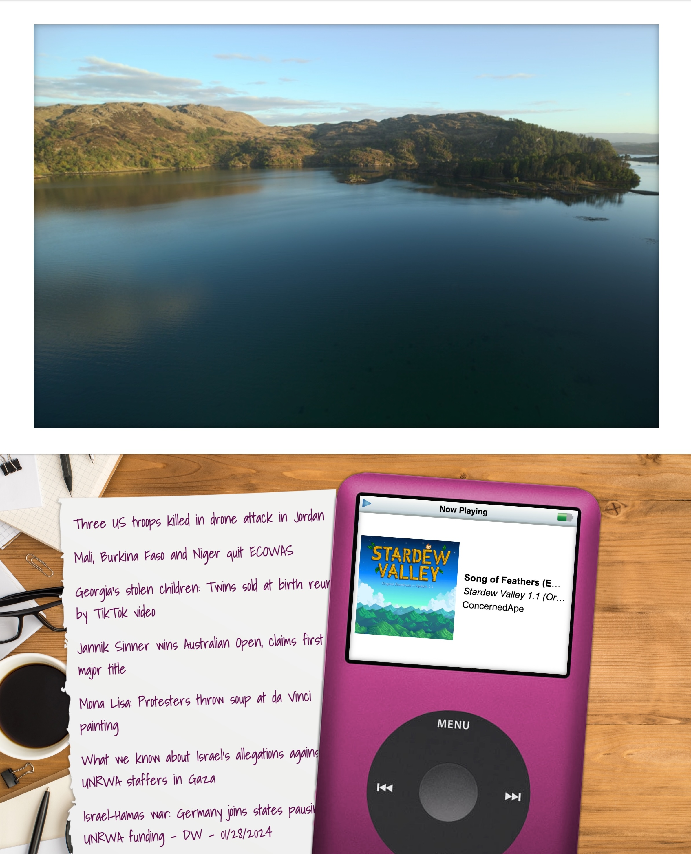
Honestly, I really like it! I like the aesthetics of the older iPod, seeing actual layers of things and some visual interest where the metaphor holds together visually. It's giving me serious "faux VR vibes" nostalgia like the software from the early 00s such as Win3D.
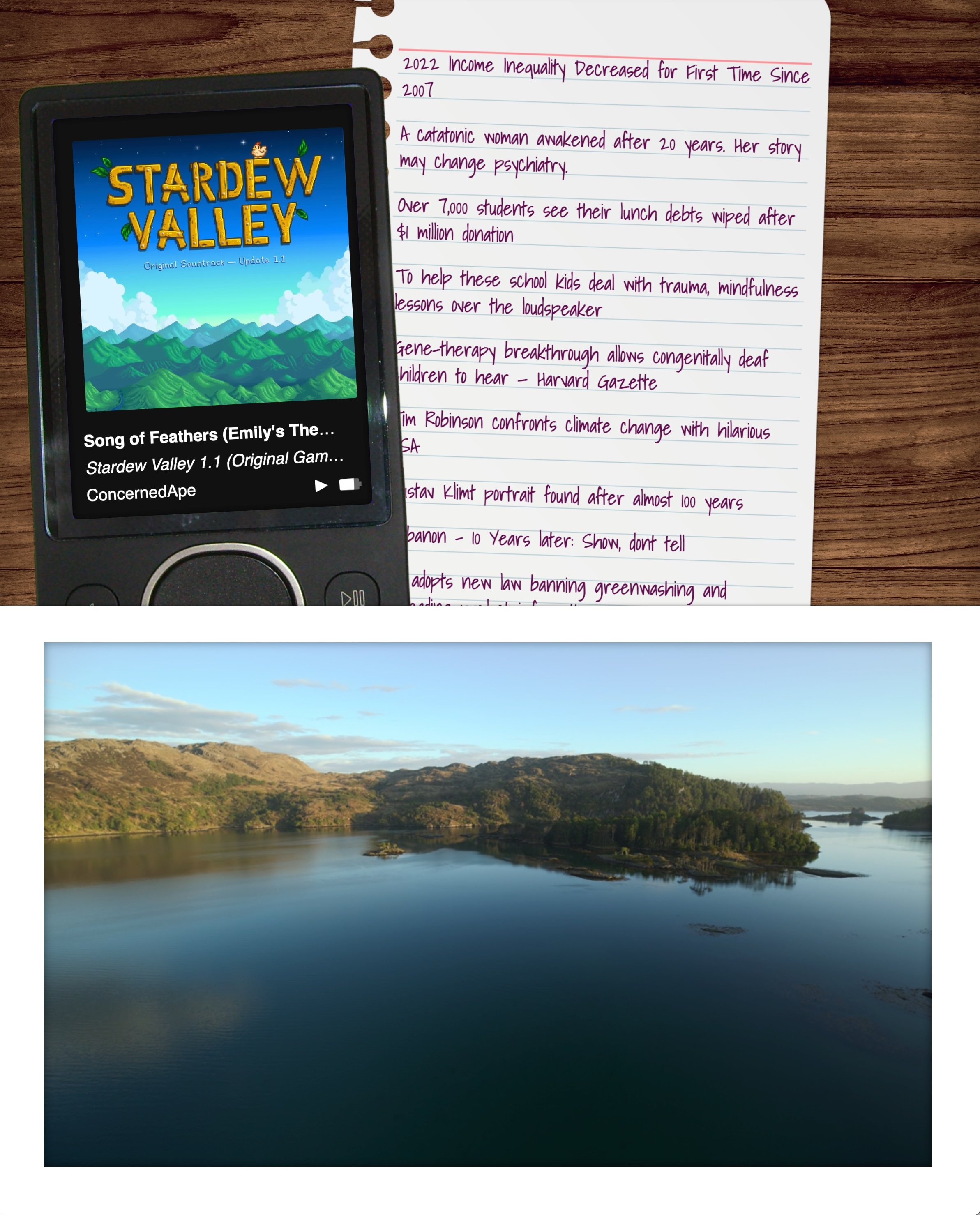
But I couldn't stop there. After all, I'd get burn-in if I left the same images on the screen for too long. So, every 12 minutes or so, when the image/video updates, there's a 50% chance the screen will shift to show the other view.
No vendor lock-in, here!
Not everything has to use the same design language! Feels like there’s a space between all and nothing. “Some.” Is that a thing? Can some things be flat and some skeuomorphic and some crazy and some Windows XP?
We can maybe skip over Aero, though. Woof.